edX and Coursera Refresh their Brand: New Logos, New Homepages
Online course providers and Class Central introduce new visual identities to welcome 2021.
Last month, Class Central unveiled a new logo and homepage. It turns out we weren’t the only ones planning an end-of-year visual refresh. Last week, edX and Coursera also introduced new logos and homepages, both on December 15. To mark the occasion, let’s compare the before and after.
edX

edX’s previous logo had remained virtually unchanged since the online course provider was created eight years ago. It consisted of a three-color wordmark that played on letters’ overlap and transparency. It has given way to a right-slanted light wordmark on a dark-green backdrop.

edX’s new homepage also embraces the right-slant and bolder colors. They’re used extensively across the page, for instance, to style the top “Register” button. Red buttons actually appeared a month ago on edX’s homepage — an early indication of the visual refresh that would follow.
To learn more about the course provider, read our 2020 end-of-year analysis of edX.
Coursera

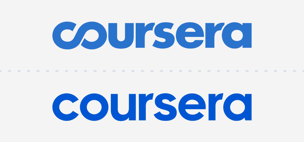
On Coursera’s side, changes have been more subtle. The main one probably pertains to the logo: the provider’s wordmark doesn’t include an infinity symbol anymore. In addition, the logo is now a brighter blue — a color also used across Coursera’s new homepage to accent elements.

To learn more about the course provider, read our 2020 end-of-year analysis of Coursera.
Class Central
edX and Coursera’s December facelifts come in the wake of Class Central’s own visual refresh. In November, we redesigned our homepage and introduced a new logo: the Class Central chalkboard. You can learn all about it here or in our wider recap of Class Central’s 2020.
Masterclass & DataCamp

In October, two other providers unveiled new identities. MasterClass introduced a minimalist logo and a new approach to uniquely brand each of its courses through typography and color. And DataCamp reimagined its entire brand, including its logo and platform’s design system.


rayane
hey edX I like you’r web site but it leterly have some thing Not and Not good, I mean like you don’t have different language (arabic, frensh or even spanish)
So have a nice day and Thanks for reading this Comment