The Best Data Visualization Courses — Class Central Career Guides
Part four of our six-piece series that recommends the best MOOCs for launching yourself into the data science industry
Editor’s note: Drop us a note at [email protected] if you have any feedback or requests for particular career guides. We are also looking for contributors!
Here are the parts of the series that have been published so far:
- The Best Intro to Programming Courses for Data Science
- The Best Statistics & Probability Courses for Data Science
- The Best Intro to Data Science Courses
- The Best Data Visualization Courses (this one)
- The Best Machine Learning Courses
Our Pick
The best online data visualization course or series is the University of California, Davis’ Data Visualization with Tableau Specialization. A five-course series, it dives deep into visualization theory. Opportunities to practice Tableau are provided through walkthroughs and a final project. Released in late 2016, it is a relatively new specialization and only has one 4-star review across all of its courses.
Data Visualization with Tableau Specialization by the University of California, Davis on Coursera
Visualization Theory and R, Learned by Doing
Another great option is DataCamp’s Data Visualization with ggplot2 series, especially if you would like to learn R and, more specifically, ggplot2. It is a three-part series that is endorsed by ggplot2 creator Hadley Wickham. A substantial amount of theory is covered. Tool coverage and practice are impressive as well — you will know R and its quirky syntax quite well leaving these courses. There are no reviews for these courses on the review sites used for this analysis.
Data Visualization with ggplot2 by DataCamp
- Data Visualization with ggplot2 (Part 1)
- Data Visualization with ggplot2 (Part 2)
- Data Visualization with ggplot2 (Part 3)
A Practical Intro to Tableau with an Excellent Instructor
Taught by Kirill Eremenko, SuperDataScience’s Tableau 10 Series is an effective practical introduction. It focuses mostly on tool coverage (Tableau) rather than data visualization theory. Eremenko is one of the most well-regarded instructors in these guides with consistently positive reviews across of his courses. The A-Z course is a prerequisite to the Advanced Training course.
The series has a 4.6-star weighted average rating over 3724 reviews.
Tableau 10 Series by Kirill Eremenko and the SuperDataScience Team on Udemy
- Tableau 10 A-Z: Hands-On Tableau Training For Data Science!
- Tableau 10 Advanced Training: Master Tableau in Data Science
Table of Contents
- Why You Should Trust Us
- About the Data Science Career Guide
- How We Picked Courses to Consider
- How We Tested
- Why Prioritize Visualization Theory
- Exploratory vs. Explanatory Visualization
- Coding Experience Sometimes Required
- Review Data Lacking
- Our Pick
- Visualization Theory and R, Learned by Doing
- A Good Mix of Theory and Python
- The Competition
- About Class Central Career Guides
- Author Bio
Why You Should Trust Us
I started creating my own data science master’s degree using online courses almost a year ago. I have taken many data science-related courses and audited portions of many more. I know the options out there, and what skills are needed for learners preparing for a data analyst or data scientist role.
For this guide, I spent 10+ hours trying to identify every online data visualization course offered as of March 2017, extracting key bits of information from their syllabi and reviews, and compiling their ratings. For this task, I turned to none other than the open source Class Central community and its database of thousands of course ratings and reviews.
Since 2011, Class Central founder Dhawal Shah has kept a closer eye on online courses than arguably anyone else in the world. Dhawal personally helped me assemble this list of resources.
About the Data Science Career Guide
Class Central’s Data Science Career Guide is a six-piece series that recommends the best MOOCs for launching yourself into the data science industry. The first five pieces recommend the best courses for several data science core competencies (programming, statistics, the data science process, data visualization, and machine learning). The final piece is a summary of those courses and the best MOOCs for other key topics such as data wrangling, databases, and even software engineering.
Here are the parts of the series that have been published so far:
- The Best Intro to Programming Courses for Data Science
- The Best Statistics & Probability Courses for Data Science
- The Best Intro to Data Science Courses
- The Best Data Visualization Courses (this one)
- The Best Machine Learning Courses
P.S. If you are looking for a complete list of Data Science MOOCs, you can find them on Class Central’s Data Science and Big Data subject page.
How We Picked Courses to Consider
Each course must fit three criteria:
- The majority of the course must be focused on explanatory data visualization. Coverage of data preparation, for example, is permitted given it is an important part of the data visualization process. Courses that cover less relevant topics (statistical modeling, for example) are excluded. More on the explanatory distinction below.
- It must be on-demand or offered every few months.
- It must be an interactive online course, so no books or read-only tutorials. Though these are viable ways to learn, this guide focuses on courses.
We believe we covered every notable course that fits the above criteria. Since there are seemingly hundreds of courses on Udemy, we chose to consider the most-reviewed and highest-rated ones only. There’s always a chance that we missed something, though, so please let us know in the comments section if we left a good course out.
How We Tested
We compiled average rating and number of reviews from Class Central and other review sites to calculate a weighted average rating for each course. We read text reviews and used this feedback to supplement the numerical ratings.
We made subjective syllabus judgment calls based on two factors, with the first given preference over the second:
- Coverage of data visualization theory. Are the motivations for visualization choices explained? Does the course only teach the tool? More on this in the next section.
- Coverage of chosen data visualization tool(s). Does the course effectively teach common visualization tools (Tableau, ggplot2, Seaborn, etc.)? Do students have opportunities to practice these skills? No preference for tool choice is given.
Why Prioritize Visualization Theory
Mastery of a specific tool is wasteful without knowledge of the fundamentals of effective visualization. Plus, tools are often interchangeable depending on the setting.
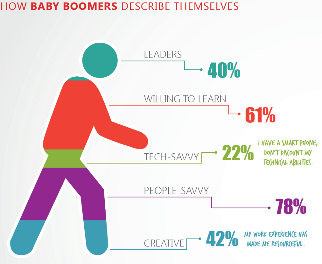
More importantly, doing good data visualization is more complex than most people think. Careful thought is required from the planning stages to execution. Choosing the right chart, balancing complexity and clutter, leveraging preattentive properties, and more, data visualization is both an art and a science. It is easy to go wrong, and sometimes horribly (see below).
Exploratory vs. Explanatory Visualization
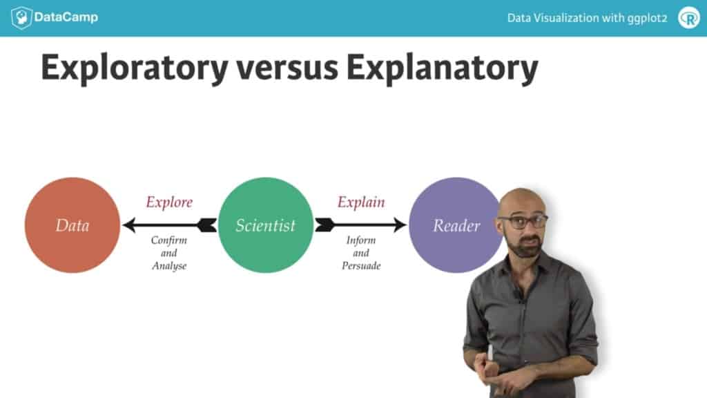
As described by Indiana University professor Yong-Yeol Ahn, the aim of explanatory data visualization is to communicate insights and messages, while the aim of exploratory visualization is to discover hidden patterns.
This article focuses on explanatory data visualization courses. Courses like Udacity’s Data Analysis with R (exclusively an exploratory course) are therefore excluded from this article. The topic is important; there just aren’t enough courses to justify a standalone article. It will be covered briefly in the summary article for this series.
Coding Experience Sometimes Required
Some courses listed below require basic coding skills in the course’s language of instruction. If you have very little programming experience, our recommendations in the first article in this series — the best intro to programming courses for data science — would be a great start. Both Python and R courses are covered.
Review Data Lacking
Compared to the other articles in the series, there is a lack of review data for data visualization courses that fit the above criteria. There is also no clear best data visualization course yet. The recommendations below are therefore not as conclusive as past articles. As always, but especially here, try to pick the course that best fits your needs.
Our Pick
Data Visualization with Tableau Specialization by the University of California, Davis on Coursera
…which contains the following five courses:
- Fundamentals of Visualization with Tableau
- Essential Design Principles for Tableau
- Visual Analytics with Tableau
- Creating Dashboards and Storytelling with Tableau
- Data Visualization with Tableau Project
The University of California, Davis’ Data Visualization with Tableau Specialization has the best combination of theory and tool coverage available based on this article’s evaluation criteria. It dives deep into theory like few other courses. There are opportunities to practice Tableau via walkthroughs and a final project, though mastering Tableau is not the main focus. It is a fairly new specialization (late 2016) and the courses only have one 4-star rating between them on the review sites used for this analysis.
Govind Acharya, Hunter Whitney, and Suk Brar are the instructors. Acharya is a Principal Analyst at UC Davis. Whitney and Brar are respected industry professionals. Between them, they have decades of data visualization experience that is clearly conveyed through the course content. The videos are well-produced.
Listed below are the details for each course, including their description, syllabus, and prominent reviews.
Data Visualization with Tableau Specialization
Basic Information
University: University of California, Davis
Instructors: Govind Acharya, Hunter Whitney, and Suk Brar
Platform: Coursera
Pace: Self-paced
Cost: Free and paid options available
Estimated timeline: 22 weeks at 3-8 hours per week (this estimate is assuredly too high, as noted by several reviewers)
Description
In 2020 the world will generate 50 times the amount of data as in 2011. And 75 times the number of information sources (IDC, 2011). Being able to use this data provides huge opportunities and to turn these opportunities into reality, people need to use data to solve problems.
This Specialization, in collaboration with Tableau, is intended for newcomers to data visualization with no prior experience using Tableau. We leverage Tableau’s library of resources to demonstrate best practices for data visualization and data storytelling. You will view examples from real world business cases and journalistic examples from leading media companies.
By the end of this specialization, you will be able to generate powerful reports and dashboards that will help people make decisions and take action based on their business data. You will use Tableau to create high-impact visualizations of common data analyses to help you see and understand your data. You will apply predictive analytics to improve business decision making. The Specialization culminates in a Capstone Project in which you will use sample data to create visualizations, dashboards, and data models to prepare a presentation to the executive leadership of a fictional company.
Syllabus
[expand title=”View Detailed Syllabus” tag=”b” swaptitle=”Hide Detailed Syllabus” trigclass=”arrowright”]
Course 1: Fundamentals of Visualization with Tableau
In this first course of the specialization, you will discover just what data visualization is, and how we can use it to better see and understand data. Using Tableau, we’ll examine the fundamental concepts of data visualization and explore the Tableau interface, identifying and applying the various tools Tableau has to offer. By the end of the course you will be able to prepare and import data into Tableau and explain the relationship between data analytics and data visualization. This course is designed for the learner who has never used Tableau before, or who may need a refresher or want to explore Tableau in more depth. No prior technical or analytical background is required. The course will guide you through the steps necessary to create your first visualization story from the beginning based on data context, setting the stage for you to advance to the next course in the Specialization.
- Getting Started & Introduction to Data Visualization
- Exploring and Navigating Tableau
- Making Data Connections
- Context of Data Visualization & Course Wrap-Up
Course 2: Essential Design Principles for Tableau
In this course, you will analyze and apply essential design principles to your Tableau visualizations. This course assumes you understand the tools within Tableau and have some knowledge of the fundamental concepts of data visualization. You will define and examine the similarities and differences of exploratory and explanatory analysis as well as begin to ask the right questions about what’s needed in a visualization. You will assess how data and design work together, including how to choose the appropriate visual representation for your data, and the difference between effective and ineffective visuals. You will apply effective best practice design principles to your data visualizations and be able to illustrate examples of strategic use of contrast to highlight important elements. You will evaluate pre-attentive attributes and why they are important in visualizations. You will exam the importance of using the “right” amount of color and in the right place and be able to apply design principles to de-clutter your data visualization.
- Getting Started in Effective and Ineffective Visuals
- Visual Perception and Cognitive Load
- Design Best Practices and Exploratory Analysis
- Design for Understanding
Course 3: Visual Analytics with Tableau
In this third course of the specialization, we’ll drill deeper into the tools Tableau offers in the areas of charting, dates, table calculations and mapping. We’ll explore the best choices for charts, based on the type of data you are using. We’ll look at specific types of charts including scatter plots, Gantt charts, histograms, bullet charts and several others, and we’ll address charting guidelines. We’ll define discrete and continuous dates, and examine when to use each one to explain your data. You’ll learn how to create custom and quick table calculations and how to create parameters. We’ll also introduce mapping and explore how Tableau can use different types of geographic data, how to connect to multiple data sources and how to create custom maps.
- Getting Started and Charting
- Dates
- Table Calculations
- Mapping
Course 4: Creating Dashboards and Storytelling with Tableau
Leveraging the visualizations you created in the previous course, Visual Analytics with Tableau, you will create dashboards that help you identify the story within your data, and you will discover how to use Storypoints to create a powerful story to leave a lasting impression with your audience.
You will balance the goals of your stakeholders with the needs of your end-users, and be able to structure and organize your story for maximum impact. Throughout the course you will apply more advanced functions within Tableau, such as hierarchies, actions and parameters to guide user interactions. For your final project, you will create a compelling narrative to be delivered in a meeting, as a static report, or in an interactive display online.
- Planning and Preproduction: Aligning your Audience, Stakeholders, and Data
- Key Metrics, Indicators, and Decision Triggers
- Dashboard and Storytelling with Data
- Tell the Story of Your Data
Course 5: Data Visualization with Tableau Project
In this project-based course, you will follow your own interests to create a portfolio worthy single-frame viz or multi-frame data story that will be shared on Tableau Public. You will use all the skills taught in this Specialization to complete this project step-by-step, with guidance from your instructors along the way. You will first create a project proposal to identify your goals for the project, including the question you wish to answer or explore with data. You will then find data that will provide the information you are seeking. You will then import that data into Tableau and prepare it for analysis. Next you will create a dashboard that will allow you to explore the data in depth and identify meaningful insights. You will then give structure to your data story by writing the story arc in narrative form. Finally, you will consult your design checklist to craft the final viz or data story in Tableau. This is your opportunity to show the world what you’re capable of – so think big, and have confidence in your skills!
[/expand]
Reviews
They not only tell you how to do the visualization design but also tell you why (the physiology, the principles). I would highly recommend this class.
Great course — guards against some subtle pitfalls in visualization preparation.
Although a very basic introduction to the use of Tableau, the course provides a broad and interesting background that should prove useful to anyone seeking to enhance their understanding of visualization fundamentals.
Reviews obtained from the individual course pages linked above.
Visualization Theory and R, Learned by Doing
Data Visualization with ggplot2 by DataCamp
…for which there are three parts:
- Data Visualization with ggplot2 (Part 1)
- Data Visualization with ggplot2 (Part 2)
- Data Visualization with ggplot2 (Part 3)
DataCamp’s Data Visualization with ggplot2 series is another great option is you want to learn R and, more specifically, ggplot2. A substantial amount of theory is covered, which is fitting given that ggplot2 is inspired by The Grammar of Graphics. Tool coverage and practice are impressive as well — you will know R and its quirky syntax quite well leaving these courses.
The instructor for all three courses is Rick Scavetta, who is a biologist, workshop trainer, freelance data scientist, and cofounder of Science Craft. DataCamp’s hybrid teaching style leverages video (starring Scavetta) and text-based instruction with lots of examples through an in-browser code editor. The video, text, and code content is polished nicely.
Listed below are the details for each course, including their description, syllabus, and prominent reviews.
Data Visualization with ggplot2 (Parts 1-3)
Basic Information
Instructors: Rick Scavetta
Platform: DataCamp
Pace: Self-paced
Cost: The first chapter of each course is available for free. A DataCamp subscription, which is currently $29 per month or $300 per year, is required for full access.
Estimated timeline: 16 hours for all three parts
Description
Part 1: The ability to produce meaningful and beautiful data visualizations is an essential part of your skill set as a data scientist. This course, the first R data visualization tutorial in the series, introduces you to the principles of good visualizations and the grammar of graphics plotting concepts implemented in the ggplot2 package. ggplot2 has become the go-to tool for flexible and professional plots in R. Here, we’ll examine the first three essential layers for making a plot – Data, Aesthetics and Geometries. By the end of the course you will be able to make complex exploratory plots.
Part 2: This ggplot2 tutorial builds on your knowledge from the first course to produce meaningful explanatory plots. We’ll explore the last four optional layers. Statistics will be calculated on the fly and we’ll see how Coordinates and Facets aid in communication. Publication quality plots will be produced directly in R using the Themes layer. We’ll also discuss details on data visualization best practices with ggplot2 to help make sure you have a sound understanding of what works and why. By the end of the course, you’ll have all the tools needed to make a custom plotting function to explore a large data set, combining statistics and excellent visuals.
Part 3: In this third ggplot2 course, we’ll dive into some advanced topics including geoms commonly used in maths and sciences, strategies for handling large data sets, a variety of specialty plots, and some useful features of ggplot2 internals.
Syllabus
[expand title=”View Detailed Syllabus” tag=”b” swaptitle=”Hide Detailed Syllabus” trigclass=”arrowright”]
Part 1
- Introduction: In this chapter we’ll get you into the right frame of mind for developing meaningful visualizations with R. You’ll understand that as a communications tool, visualizations require you to think about your audience first. You’ll also be introduced to the basics of ggplot2 – the 7 different grammatical elements (layers) and aesthetic mappings.
- Data: The structure of your data will dictate how you construct plots in ggplot2. In this chapter, we’ll explore the iris dataset from several different perspectives to showcase this concept. You’ll see that making your data conform to a structure that matches the plot in mind will make the task of visualization much easier through several R data visualization examples.
- Aesthetics: Aesthetic mappings are the cornerstone of the grammar of graphics plotting concept. This is where the magic happens – converting continuous and categorical data into visual scales that provide access to a large amount of information in a very short time. In this chapter we’ll understand how to choose the best aesthetic mappings for your data.
- Geometries: A plot’s geometry dictates what visual elements will be used. In this chapter, we’ll familiarize you with the geometries used in the three most common plot types you’ll encounter – scatter plots, bar charts and line plots. We’ll look at a variety of different ways to construct these plots.
- qplot and wrap-up: In this chapter you’ll learn about qplot; it is a quick and dirty form of ggplot2. It’s not as intuitive as the full-fledged ggplot() function but may be useful in specific instances. This chapter also features a wrap-up video and corresponding data visualization exercises.
Part 2
- Statistics: In this chapter, we’ll delve into how to use R ggplot2 as a tool for graphical data analysis, progressing from just plotting data to applying a variety of statistical methods. This includes a variety of linear models, descriptive and inferential statistics (mean, standard deviation and confidence intervals) and custom functions.
- Coordinates and Facets: The Coordinates and Facets layers offer specific and very useful tools for efficiently and accurately communicating data. In this chapter we’ll look at the various ways of effectively using these two layers.
- Themes: Now that you’ve built high-quality plots, it’s time to make them pretty. This is the last step in the data viz process. The Themes layer will enable you to make publication quality plots directly in R.
- Best Practices: Once you have the technical skill to make great visualizations, it’s important that you make them as meaningful as possible. In this chapter we’ll go over three plot types that are mostly discouraged in the data viz community – heat maps, pie charts and dynamite plots. We’ll understand what the problems are with these plots and what the alternatives are.
- Case Study: In this case study, we’ll explore the large, publicly available California Health Interview Survey dataset from 2009. We’ll go step-by-step through the development of a new plotting method – a mosaic plot – combining statistics and flexible visuals. At the end, we’ll generalize our new plotting method to use on a variety of datasets we’ve seen throughout the first two courses.
Part 3
- Statistical plots: Actually, all the plots you’ve explored in the first two ggplot2 courses can be considered ‘statistical plots’. Here, however, you’ll consider those that are intended for a specialist audience that is familiar with the data: box plots and density plots.
- Plots for specific data types (Part 1): In this chapter, you’ll explore useful specialty plots for specific data types such as ternary plots, networks and maps. You’ll also look at how to use ggplot2 to convert typical base package plots that are used to evaluate the results of statistical methods. Finally, you’ll take a look at a couple ways in which you can make and appropriately use animations.
- Plots for specific data types (Part 2): In this chapter, we’ll continue our discussion of plots for specific data types by diving into the world of maps. You’ll also have a look at animations to make your data come to life
- ggplot2 Internals: In this chapter, you’ll delve into ggplot2 internals, exploring the grid package and ggproto. You’ll learn how to use these tools to create unique plots.
- Data Munging and Visualization Case Study: In this chapter, you’ll draw on some of the many tools for effective data visualization that we’ve covered over the three ggplot2 courses and combine them with some data munging techniques.
[/expand]
Reviews
The following endorsement is from Hadley Wickham, Chief Scientist at RStudio and ggplot2 creator:
I thoroughly recommend “Data Visualization with ggplot2” by Rick Scavetta. It gives you an excellent introduction to ggplot2. You’ll learn both the underlying theory, and get hands-on practice in DataCamp’s online learning environment.
A Practical Introduction to Tableau with an Excellent Instructor
Tableau 10 Series by Kirill Eremenko and the SuperDataScience Team on Udemy, which includes:
- Tableau 10 A-Z: Hands-On Tableau Training For Data Science!
- Tableau 10 Advanced Training: Master Tableau in Data Science
Taught by Kirill Eremenko, SuperDataScience’s Tableau 10 Series is an effective practical introduction. It focuses mostly on tool coverage (Tableau) rather than data visualization theory. Eremenko is one of the most well-regarded instructors in these guides with consistently positive reviews across of his courses. The A-Z course is a prerequisite to the Advanced Training course.
The series has a 4.6-star weighted average rating over 3724 reviews.
Listed below are the details for each course, including their description, syllabus, and prominent reviews.
Tableau 10 A-Z: Hands-On Tableau Training For Data Science!
Basic Information
Instructors: Kirill Eremenko and the SuperDataScience Team
Platform: Udemy
Pace: Self-paced
Cost: Varies depending on Udemy discounts, which are frequent. Can be purchased for as little as $10.
Estimated timeline: 8 hours
Description
Learn data visualization through Tableau 10 and create opportunities for you or key decision makers to discover data patterns such as customer purchase behavior, sales trends, or production bottlenecks.
You’ll learn all of the features in Tableau that allow you to explore, experiment with, fix, prepare, and present data easily, quickly, and beautifully.
Syllabus
[expand title=”View Detailed Syllabus” tag=”b” swaptitle=”Hide Detailed Syllabus” trigclass=”arrowright”]
- It’s super easy to get Started
- Tableau Basics: Your First Bar chart
- Time series, Aggregation, and Filters
- Maps, Scatterplots, and Your First Dashboard
- Joining and Blending Data, PLUS: Dual Axis Charts
- Table Calculations, Advanced Dashboards, Storytelling
- Advanced Data Preparation
- What’s new in Tableau 10
- Conclusion
[/expand]
Reviews
I really enjoyed Kirill’s course! It was insightful, well thought out, and truly enjoyable; his enthusiasm is helpful as well!
Being a Tableau beginner with some basic concepts, the course helped solidify the basics and more importantly, the theory behind them. I now understand how more advanced features work that I had prior just poked at until they functioned as I wanted them.
I would recommend this course for new Tableau users or anyone who isn’t sure why their viz is acting the way it is. When posting questions, I received timely feedback as well!
Tableau 10 Advanced Training: Master Tableau in Data Science
Basic Information
Instructors: Kirill Eremenko and the SuperDataScience Team
Platform: Udemy
Pace: Self-paced
Cost: Varies depending on Udemy discounts, which are frequent. Can be purchased for as little as $10.
Estimated timeline: 9 hours
Description
Ready to take your Tableau skills to the next level? Want to truly impress your boss and the team at work? This course is for you!
Hours of professional Tableau Video training, unique datasets designed with years of industry experience in mind, engaging exercises that are both fun and also give you a taste for Analytics of the REAL WORLD.
In this course you will learn:
- How to use Groups and Sets to increase your work efficiency 10x
- Everything about Table Calculations and how to use their power in your analysis
- How to perform Analytics and Data Mining in Tableau
- How to create Animations in Tableau
- And much, much more!
Each module is independent so you can start learning from wherever you see fit. The more you learn the better you will get. However, you can stop at any time you will still have a strong set of skills to take with you.
Syllabus
[expand title=”View Detailed Syllabus” tag=”b” swaptitle=”Hide Detailed Syllabus” trigclass=”arrowright”]
- Introduction
- Groups and Sets
- Advanced Table Calculations
- Advanced Data Prep + Analytics In Tableau
- Creating Animations in Tableau
- Level Of Detail Calculations (LOD)
- Conclusion
- Bonus Lectures
[/expand]
Reviews
This was great. I use Tableau daily but it was an awesome refresher on some of the items i don’t use and a great study aid for sitting the Tableau Certified Professional Exam. Good job Kirill and the Team!
Kirill is a tremendous teacher and students taking this course will clearly see why he has dozens of courses and thousands of students — he’s able to teach complex skills, in a real world business context and do so incrementally thereby combining the often complex task of teaching both fundamentals and context specific applications simultaneously.
The competition
Let’s look at the other alternatives, sorted by descending rating.
Interactive Data Visualization with Python & Bokeh (Ardit Sulce/Udemy): Tool focus (Python and Bokeh). Includes a section on creating web applications. Seven hours of video. Cost varies depending on Udemy discounts, which are frequent. It has a 4.6-star weighted average rating over 103 reviews.
Information Visualization (IVMOOC) (Indiana University/Independent): Covers theory and multiple tools in great detail. Impressive real-life project. Registration did not work when attempted despite emails to the course administrators. A full twelve-week graduate course. Free. It has a 4.5-star weighted average rating over 2 reviews.
Analyzing and Visualizing Data with Power BI (Microsoft/edX): Tool focus (Power BI). Tailored for business users invested in the Microsoft ecosystem. Part of the Microsoft Professional Program Certificate in Data Science. Estimated timeline of two to four hours per week over six weeks. Free with a Verified Certificate available for purchase. It has a 4.5-star weighted average rating over 117 reviews.
Analyzing and Visualizing Data with Excel (Microsoft/edX): Tool focus (Excel). Tailored for business users invested in the Microsoft ecosystem. Part of the Microsoft Professional Program Certificate in Data Science. Estimated timeline of two to four hours per week over six weeks. Free with a Verified Certificate available for purchase. It has a 4.5-star weighted average rating over 972 reviews.
Tableau for Beginners — Get Certified Accelerate Your Career (Lukas Halim/Udemy): Tool focus (Tableau). Four hours of video. Cost varies depending on Udemy discounts, which are frequent. It has a 4.5-star weighted average rating over 649 reviews.
Data Visualize Data with D3.js The Easy Way (Infinite Skills/Udemy): Tool focus (D3.js). Four hours of video. Cost varies depending on Udemy discounts, which are frequent. It has a 4.4-star weighted average rating over 262 reviews.
Data Visualization with Python and Matplotlib (Stone River eLearning/Udemy): Tool focus (Python and Matplotlib). Six hours of video. Cost varies depending on Udemy discounts, which are frequent. It has a 4.4-star weighted average rating over 92 reviews.
Data Analysis: Visualization and Dashboard Design (Delft University of Technology/edX): Tool (Excel) and business focus. Estimated timeline of four to six hours per week over six weeks. Free with a Verified Certificate available for purchase. It has a 4.2-star weighted average rating over 5 reviews.
Big Data: Data Visualisation (Queensland University of Technology/FutureLearn): Balanced theory/tool focus. Exposure to a variety of tools. Starts August 2017. Estimated timeline of two hours per week over three weeks. Free with an “upgrade” available for purchase. It has a 4-star rating over 1 review.
Data Visualization and Communication with Tableau (Duke University/Coursera): Tool (Tableau) and business focus. Part of the Excel to MySQL: Analytic Techniques for Business Specialization. Estimated timeline of six to eight hours per week over five weeks. Free and paid options available. It has a 3.67-star weighted average rating over 9 reviews.
Data Visualization (University of Illinois at Urbana-Champaign/Coursera): Theory focus. Part of the Data Mining Specialization. Estimated timeline of four to six hours per week over four weeks. Free and paid options available. It has a 3.14-star weighted average rating over 22 reviews.
Data Visualization and D3.js (Udacity): Balanced theory/tool focus. The D3.js instruction feels “incomplete” and “out of place.” Estimated timeline of seven weeks. Free. It has a 2.83-star weighted average rating over 6 reviews.
Data Management and Visualization (Wesleyan University/Coursera): Balanced theory/tool focus. Covers multiple tools (Python and SAS). Part of Wesleyan’s Data Analysis and Interpretation Specialization. Estimated timeline of four to five hours per week over four weeks. Free and paid options available. It has a 2.67-star weighted average rating over 6 reviews.
Applied Plotting, Charting & Data Representation in Python (University of Michigan/Coursera): Balanced theory and tool focus. Free and paid options available. It has a 2-star weighted average rating over 4 reviews.
The following courses had no reviews as of March 2017.
Data Visualization in Tableau (Udacity): Theory focus with excellent coverage. Brief tool coverage (Tableau). Primarily text-based instruction with multiple choice quizzes. Part of Udacity’s Data Analyst Nanodegree and Predictive Analytics for Business Nanodegree. Estimated timeline of three weeks. Free.
Building Data Visualization Tools (Johns Hopkins University/Coursera): Tool focus (R and ggplot2). Part of JHU’s Mastering Software Development in R Specialization. Estimated timeline of two hours per week over four weeks. Free and paid options available.
Data Visualization for All (Trinity College/edX): Theory focus. Estimated timeline of three hours per week over six weeks. Free with Verified Certificate available for purchase.
Data Visualization with Advanced Excel (PwC/Coursera): Tool focus (Excel). Part of PwC’s Data Analysis and Presentation Skills: the PwC Approach Specialization. Estimated timeline of three to four hours per week over four weeks. Free and paid options available.
Communicating Business Analytics Results (University of Colorado Boulder/Coursera): Theory and business focus. Part of Colorado Boulder’s Data Analytics for Business Bootcamp Specialization. Estimated timeline of four weeks. Free and paid options available.
Storytelling Through Data Visualization (Dataquest): Mostly a tool focus (Python, Matplotlib, and Seaborn). Estimated timeline unclear. Mostly free, but a subscription isf required for full access.
Data Visualization Learning Path (O’Reilly): Balanced tool/theory focus. Covers D3.js. Multiple instructors. Fifteen hours of content. Free with a ten-day free trial.
Data Visualization for Developers (Dan Appleman/Pluralsight): Theory focus. Tailored for developers. Two hours of content. Free with a ten-day free trial.
The following four courses are created by Bill Shander of Beehive Media and offered on Lynda. They are listed in chronological order by release date.
Data Visualization Fundamentals (Bill Shander/Lynda): Theory focus. Four hours of content. Free with a ten-day free trial.
Designing a Data Visualization (Bill Shander/Lynda): Theory focus. Covers creating a specific project from concept to data analysis to design and execution. Four hours of content. Free with a ten-day free trial.
Data Visualization for Data Analysts (Bill Shander/Lynda): Theory focus. Tailored for data analysts. Two hours of content. Free with a ten-day free trial.
Data Visualization Storytelling Essentials (Bill Shander/Lynda): Theory focus. Two hours of content. Free with a ten-day free trial.
Visualization in R, From Beginner to Advanced (Nathan Yau/FlowingData): A four-week course. Subscription required.
The following four courses are offered by DataCamp. As noted above, DataCamp’s hybrid teaching style leverages video and text-based instruction with lots of examples through an in-browser code editor.
Data Visualization in R (DataCamp): Balanced theory/tool focus. Covers base R graphics. Estimated timeline of four hours. Subscription required for full access.
Introduction to Data Visualization with Python (DataCamp): Tool focus (Python, Matplotlib, and Seaborn). Estimated timeline of four hours. Subscription required for full access.
Interactive Data Visualization with Bokeh (DataCamp): Tool focus (Python and Bokeh). Estimated timeline of four hours. Subscription required for full access.
Data Visualization in R with ggvis (DataCamp): Balanced theory/tool focus. Covers R and ggvis. Estimated timeline of four hours. Subscription required for full access.
About Class Central Career Guides
Class Central Career Guides are recommendations for the best online courses and MOOCs.
Class Central Career Guides are recommendations for the best online courses and MOOCs. They have one goal: to enable you to quickly figure out which courses can help you learn new skills and advance your career. Our editorial picks are thoroughly researched using reviews written by Class Central users, as well as data from other sources and our own subjective analysis.
These guides are updated frequently to always reflect the best in online education.
Drop us a note at [email protected] if you have any feedback or requests for particular career guides — it will help us prioritize. Also, reach out to us if you want to help us create more of these career guides. We are looking for contributors!
Author Bio
David Venturi created a personalized data science master’s curriculum for himself using MOOCs. He has a dual degree in Chemical Engineering and Economics, and especially enjoys math, stats, and coding. He’s a huge baseball and hockey fan, and writes about the latter with a focus on analytics.





Amitesh Kumar
This course @ https://www.udemy.com/d3js-data-visualization-projects/ is also very good. But its for developers like me.