A Better Class Central: Typography Improvements, Increased Custom Lists, and Enhanced Profile Pages
Changes include an improved interface design system, upgrades to existing features, new functionality, and optimized site performance.
Class Central is almost eight years old. Over the years and due to limited resources, we added features gradually in places where it was easiest to do so. Naturally, over time, pages ended up with design inconsistencies and unwanted page weight.
Over the past few months we have been working on improving Class Central. Here are a few highlights:
- Increasing custom lists from 5 to 25
- Improved interface design including typography
- Smaller page sizes (in some cases by 200kb)
Our team has grown in the last year, which gave us the bandwidth to take on a more time-consuming project where we could tackle these issues. Read on to find out more about these changes.
A Cleaner User Interface with Better Typography
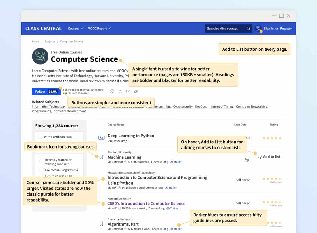
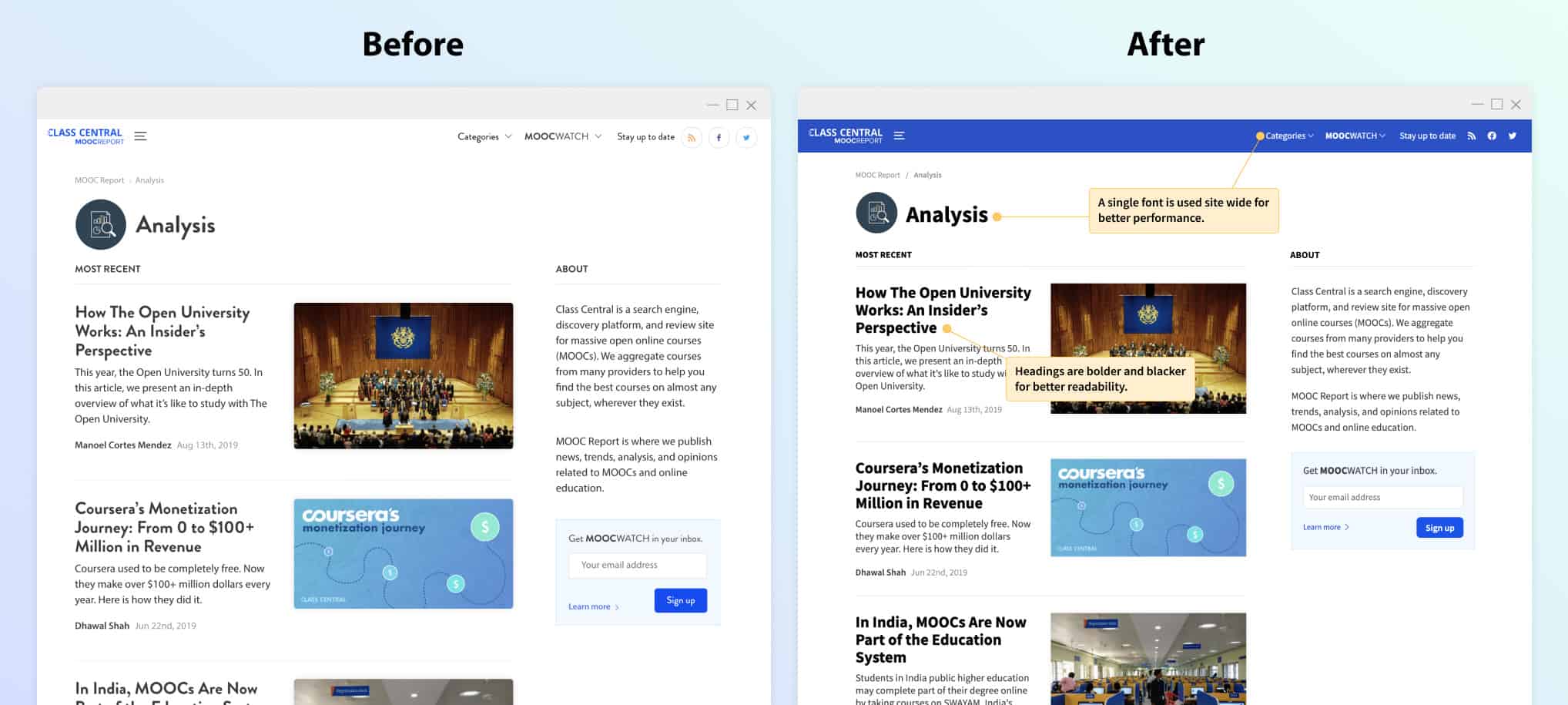
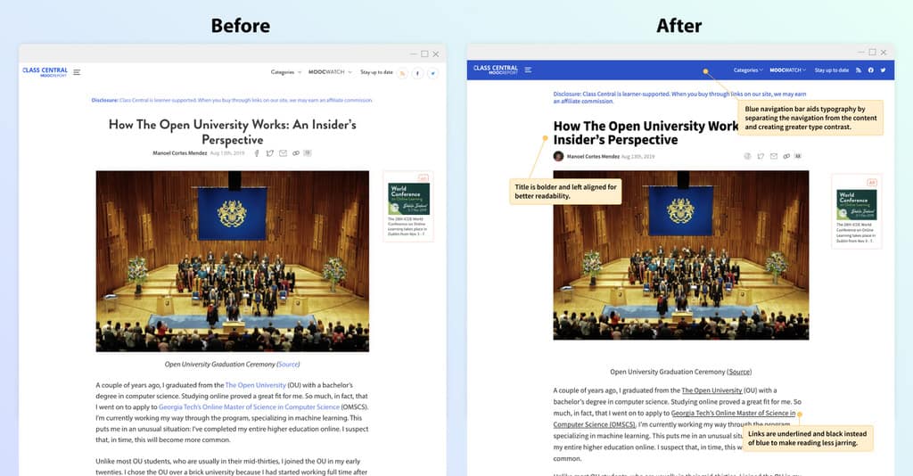
One of our priorities was to refine our design system, primarily by improving our site’s typography. We reduced several weighty fonts to a single typeface with a limited number of color and weight variations. We established a clearer hierarchy to improve the site’s legibility. Furthermore, we also tweaked various interface elements, including buttons, form fields, notifications, and icons to bring greater consistency across the site.
Profile Page Consolidation
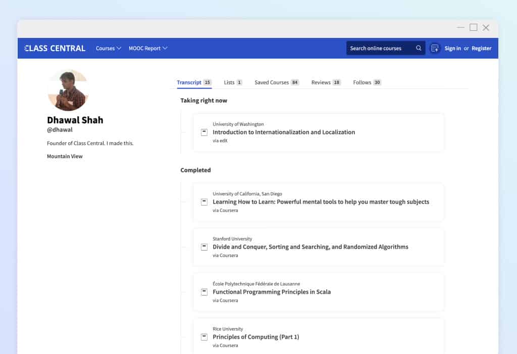
Until this recent release, you could find your courses, lists, reviews, recommendations, and follows under My Classes as well as a subset of these items on your Profile page. Taking inspiration from Github Profiles, we consolidated everything under the Profile page and removed the My Classes section entirely.
Saving and Tracking Courses
We have deprecated the +Add Button in favor of what we hope will be a more intuitive experience for saving and tracking courses. All previous functionality is still available via an updated interface, as explained below.
Bookmark Button
Based on usage stats, most users were only using the +Add Button to add courses to their “interested” list. We decided to hone in on this use case and replace the +Add Button with a more identifiable Bookmark Icon.
Any bookmarked courses will show up in the Saved Courses tab on your Profile page. Adding or removing courses is as easy as toggling the Bookmark Icon.
Add to List Button
The +Add Button previously also provided a means to add courses to a custom list. We intend to continue to enhance this feature. To move towards this goal, we’ve created a separate Add to List Button and modal. It is found when you hover over a course in a table listing. It is also on every course page. We have increased the maximum number of custom lists you can create from 5 to 25.
Progress Dropdown
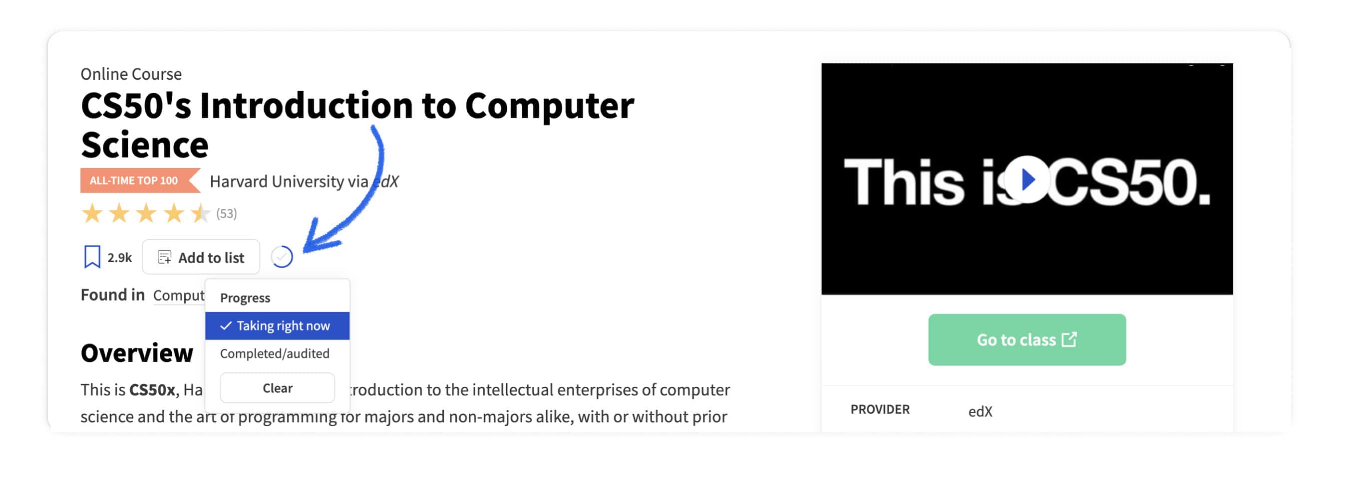
Adding courses to your Transcript is a less used feature, but one we didn’t wish to get rid of entirely. You can still mark courses as either “Taking right now” or “Completed/audited” via the new Progress Button and dropdown. You can find the Progress Button on any course page. Any marked courses will appear in the Transcript tab of your Profile page.
Quick View
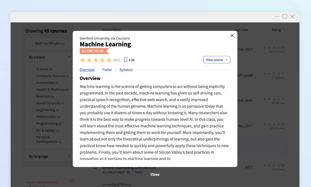
We have added the ability to quickly view additional course details without leaving the course listing page. Previously you could only view the trailer. Now you can also see overview and syllabus when available.
Improved performance
As with any codebase, unnecessary code creeps in, and deprecated code is accidentally left behind. Along with our refined design system, new and upgraded features, we simultaneously aimed to improve the site’s overall performance by refactoring and removing unnecessary code. The site now has a smaller footprint due to both a lightweight font and design system CSS, the removal of legacy CSS and javascript, and refactoring of existing code. In the end, we were able to successfully shave 200+ KB off most pages, which will speed up overall page load times for many users.
Conclusion
We hope these changes improve the overall experience for our users and provide a strong foundation for us to continue to develop new and existing features. Let us know if you have any questions or suggestions about these changes in the comments below.

Dhawal Shah




gilbert
Hi, Dhawal and Scott,
Is this the repo of your website? https://github.com/classcentral/class-central. And I found that there is no update for a long time.
Dhawal Shah
Hi Gilbert,
We took the repository private a while back. Hopefully in the future, we can open source certain parts of the site.
– Dhawal